I like this font but this will also not work on my rock magazine. I think its too 'retro' looking and will not go with other features on my magazine. The font is too square and may take the focus off my main image.
I like this font and would look good on a rock magazine. The colours that I used to experiment with also give it a different effect. I like the 'gothic' look and would be a good way of representing my 'rock' music theme/genre.
This font could work quite well on my rock magazine. It it quite different and would stand out as the masthead on my front cover. The brush stroke effect works well and could look eye-catching being layered behind my main image.
Here I found a font but I decided that it was too 'cartoon-like' for my rock magazine. The font is too round and will not look right with the images that I will be using.
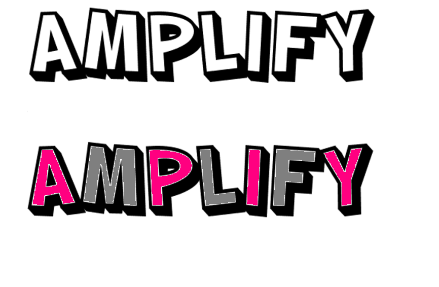
Here I have found a font and developed it by adding colour. I like the boldness of this font and this will work well for the masthead of my magazine. The large size will stand out to the reader and will work well with the main image in my front cover. The slanted lettering is appealing and makes the font more cartoon-like.
Here I have researched a variety of fonts to develop ideas on what font I may decide to use for my masthead and other text on my music magazine. Most of these fonts are quite retro, cartoon-like and horror-like. This appeals to the theme of my magazine because the genres that will be included are indie, pop, rock and many others; so this will suite the theme perfectly. I have not decided what exact font I want to use yet but I will produce more research on other styles of fonts and see which ones are most appropriate for my magazine.