Saturday 26 February 2011

Ideas for Front Cover..


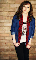
Here I have made a quick test of one of my most recent pictures from the photoshoot and changed the font of the masthead. I like the brick background and the picture is very eye-catching. I will experiment and develop my layout further by adding more text and features before making a final decision.

Saturday 12 February 2011

Editing photos..


Here I have experimented with my new photos by editing them in Photoshop. After editing previous pictures I found using the software a lot easier so I decided to develop these skills further. I like the idea of having edited pictures in my magazine as they will be very eye-catching and will stand out instantly to the reader. Depending on the choice of colour scheme for my final magazine, I will have to decide on what colours and filters to use on the photos. I wouldn't have all of my photos edited but a few could make a new, exciting change to the page.

More Photos..


These are the most recent pictures that I have taken after my draft magazine. I learnt a lot from taking the previous pictures so I made sure to make the changes that were necessary in this photo-shoot. I liked the brick background better as it relates more to the genre of my magazine and makes it more interesting instead of having a plain, white background. I still used the music equipment to continue the music genre and I may consider taking more photos nearer to the time of making my final magazine.

Thursday 10 February 2011

Double Page Spread Draft..


This is my draft version of my double page spread. I am not completely happy with it and I think that  lot of improvements can be made. I think the layout works quite well but to improve it I would use different pictures and maybe add more text. I also think that the cutting tool on photoshop should be used once again to improve the cutting out of the images. I like how the black and white images relate to my colour palette and I think the heading and border was successful.

Wednesday 9 February 2011

Editing my photos on photoshop..


At this point I have decided to edit more of my own photos to gain more skills using the Photoshop software. I used different filters on the images and individually edited them as well. I may not decide to use edited images but some of them could look quite effective if I didn't use a lot of them on each page. After taking more photos I will experiment with them as well to see which ones are more effective than others.


Wednesday 2 February 2011

Editing on Photoshop..

For this section, I decided to look at editing one of my photos of Pixie Lott by using the different filters on Photoshop. This helped me develop more ideas on whether I wanted my image realistic or abstract. The top image looks quite 'pop-arty' and would work better on a pop magazine with a different colour. the middle image looks very effective and I like how the neon emphasises her outline which makes you focus on it more. The last image also works very well and the film grain effect adds an interesting contrast to other images in current magazines which may help my magazine stand out more.

Contents Page Draft..


This is my final draft version of my contents page. I think that the layout could be improved and I don't think the white background works very well with the text and image. I think the large image in the centre of the page is successful although the images around the page would need to be changed. I think the logo works well with the font if the masthead but the main change that I would make is the layout of the page. For my final magazine I may decide to use boxes so that the reader can focus on individual areas of the page.

Producing the Contents Page...


This is just a screenshot of me in the process of making my contents page. At this point I was experimenting where to put the text and images. I was also deciding what images and font to use. I think the colour palette works quite well I like the font of the heading.

Front Cover Draft...


This is my final draft version of my front cover. Improvements can be made such as the colour of my background and font type. I like the location of the image but the features on my page could be altered. I like the border at the bottom of the page and the Masthead works quite well but I will definitely think about the choice of font and layout of the features on my front cover.