Here I have put together the interview for my draft article on my double page spread. I decided to do a question and answer interview as I related it to other magazines I have researched such as Q and Kerrang. For my final magazine I may add more text and change certain bits because I may even change the artist who I am interviewing.

Tuesday, 25 January 2011
Thursday, 20 January 2011
Artist Profile...
artist profile
Here I have put together my artist profile for my draft magazine. I will use this artist for my double page spread although for my final magazine, if I decide to change my artist, I may consider creating another artist profile. This is just basic information on my artist but the interview will include more detailed information on her.
Institution Profile/Research...
Institution profile
For this section I have researched one of my main influences, Kerrang magazine. I have found out key information which has helped me understand how selling a magazine works.
Wednesday, 19 January 2011
Rule of Thirds/Golden Spiral...
For this section I found that there are different ways of positioning the images on the magazine. Experimenting with composition improves the quality of the magazine. This link explains each technique and which sections are the main focussing point of the image.
Double Page Spread Mock Up...
double page spread mock up
Here is just a quick mock up of my double page spread. I may make some changes whilst in the process of making my draft but this is just to help me get an idea of where to locate the key features on both pages.
Contents Page Mock Up...
contents page mock up
Here I have done the same and created a rough layout for my contents page. I am going to use this as a template for making my draft but I will make changes if improvements need to be made.
Monday, 17 January 2011
Front Cover Mock Up...
front cover mock up
Now that I have produced most of my research, I have to develop ideas about creating my own magazine. I have put together a mockup of all of my pages to use as a rough template whilst making my draft magazine. This is the front cover mockup and I will refer to this when I am producing the page.
Sunday, 16 January 2011
Evaluating Test Shots...

After taking my own photographs I have realised what camera shots worked well and which ones not so well. The mid-shot photos were most appealing and by having the music equipment continues the theme of the music magazine. The rock genre is clear because of the choice of clothing and makeup. This works very well because they look quite unique and interesting. I have also edited some of my photos to black and white to add an extra effect and this also creates an exciting change to the main image. I will later develop and edit them further by using photoshop. I now need to decide which images should be on each page and I will also take more photos nearer to when I create my final magazine to see if any improvements can be made. The black and white images also work well with my colour scheme as it is grey, black, white and pink.
Wednesday, 12 January 2011
Evaluating Feedback..
After pitching my magazine idea to the class, I found out what most people thought was effective or what needs changing. Most people liked the name of my magazine 'AMPLIFY' as it relates to the music genre rock. I have came to the decision to keep to one music genre so it appeals to one type of audience. This will also make it clearer for the readers of what type of music magazine they are buying. The class also like the idea of having one large image on my front cover with the music equipment. They thought my target audience is realistic because many teenagers and young adults are interested in the rock genre. Most of my feedback was positive although the majority of the class thought that I should stick to one music genre so I have decided to focus on rock.
Wednesday, 5 January 2011
Album art.
Album Work
For this section, I researched a range of popular album covers to develop more ideas of designs and images. The layouts of these images are also relevant so I know how to layer them and mix colours. I think the black and white images work very well with colourful colour palettes because it makes you focus more on the image itself. I may consider using this feature on my magazine cover depending on the layout because this could work very well with my colour palette. These album covers are all very unique and different which is effective because it gives buyers something new to look at. I want my magazine to stand out like these album covers so that it is successful and eye-catching.
For this section, I researched a range of popular album covers to develop more ideas of designs and images. The layouts of these images are also relevant so I know how to layer them and mix colours. I think the black and white images work very well with colourful colour palettes because it makes you focus more on the image itself. I may consider using this feature on my magazine cover depending on the layout because this could work very well with my colour palette. These album covers are all very unique and different which is effective because it gives buyers something new to look at. I want my magazine to stand out like these album covers so that it is successful and eye-catching.
Magazine name...
AMPLIFY

I have researched a lot on magazine names and I wanted the name to link to the theme of music. This is relevant as readers will instantly know that the magazine is music-related. The word 'amplify' means to increase the volume of sound. This works very well for a music magazine because readers will know the meaning of the word and the significance it has to music. It is also an eye-catching name and it stands out from others because it is so direct. It will appeal to my target audience because it links to the genres of music and they will like the name because teenagers are well-known for listening to loud music. I also thought of the names 'Key Signature' or 'Chordophone' but I decided Amplify best suited the genre of my magazine.
My Pitch.
AMPLIFY, interview of artist, photo-shoot, black and white image, simple layout, eye-catching, vibrant, teenagers 16-26, inspiration from Billboard and Vibe, indie, pop, rock, effective font.
This pitch includes the basic information on my music magazine. They are key points that readers will want to know about. The information and ideas that have helped me produce this pitch will later develop even more when I actually start designing the pages of my magazine.
Monday, 3 January 2011
Moodboard/Overall Conclusion of Research and Planning..
Here I have produced a moodboard of all the ideas I have up to this point. I have produced research on each area of designing my magazine as well as additional research and gaining inspiration from other popular music magazines. These magazines have helped me develop more ideas such as layout and images. I may choose to use some of these features of the magazine on mine. By deciding what fonts and colours to use at this stage, will help me later on when designing my magazine as I can look back and see which ones work best. I have also researched my target audience, front covers, contents pages, double page spreads, fonts, colour palettes, styles of magazines and which features are most appropriate for my magazine. This research has been successful because it has helped me develop a wider range of ideas for the design and success of my magazine.
Audience Profile.
Audience Profile
Here I have produced an audience profile of a person that fits into my target audience. By getting this information, it has helped me decide on what features to use on my magazine as I get clear instructions what most teenagers and young adults want. I must meet the client's needs so that my magazine is successful and sells well.
Key notes of my magazine.
Key Notes of Music Magazine[1]
For this section, I have just pulled together some key notes that I know that I will need later on in my designing process. My deciding these points now, will help me develop more ideas later on where I may decide to change or improve them to make my magazine more successful. This section has helped me gain more inspiration from other magazines as I have researched what features they have so that I can relate them to mine later on.
Inspiration and Design Ideas.
Inspiration
To develop more ideas on the design aspects, I have researched more magazines to gain more inspiration and see what features they include to make their magazines so successful. I found that my biggest inspirations are Vibe magazine and Billboard. This is mainly because of their simple, clear layout, their large images and limited text. I like how the key focus is on the main image as it makes it more interesting for the reader. This way they instantly know what the main highlight of the magazine is in a visual way, instead of reading lots of text. The large mastheads that they use are also effective because they stand out to the reader and are very clear and consistent. The last feature that I found most appealing is the layering effect that both of these magazines use. This makes the page look fuller even though there are less features being used.
Moodboard video.
Another way of researching was to create a video of all the ideas that I have. This works as a moodboard and it brings all the ideas together. This visual presentation of images and text gives the ideas that I have a meaning and the message that my magazine is going to portray. By presenting my research in this way helps me decide what ideas need developing further and what else needs to be decided before starting to design the magazine itself.
Researching Fonts.

I like this font but this will also not work on my rock magazine. I think its too 'retro' looking and will not go with other features on my magazine. The font is too square and may take the focus off my main image.
Researching Fonts.

I like this font and would look good on a rock magazine. The colours that I used to experiment with also give it a different effect. I like the 'gothic' look and would be a good way of representing my 'rock' music theme/genre.
Researching Fonts.

This font could work quite well on my rock magazine. It it quite different and would stand out as the masthead on my front cover. The brush stroke effect works well and could look eye-catching being layered behind my main image.
Researching Fonts.

Here I found a font but I decided that it was too 'cartoon-like' for my rock magazine. The font is too round and will not look right with the images that I will be using.
Researching Fonts.
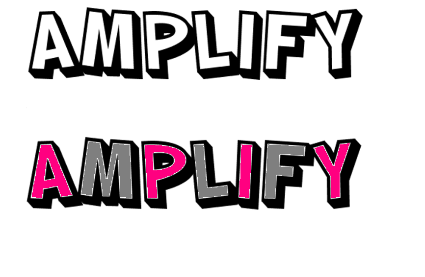
Here I have found a font and developed it by adding colour. I like the boldness of this font and this will work well for the masthead of my magazine. The large size will stand out to the reader and will work well with the main image in my front cover. The slanted lettering is appealing and makes the font more cartoon-like.
Sunday, 2 January 2011
Experimenting with fonts.
Fonts
Here I have researched a variety of fonts to develop ideas on what font I may decide to use for my masthead and other text on my music magazine. Most of these fonts are quite retro, cartoon-like and horror-like. This appeals to the theme of my magazine because the genres that will be included are indie, pop, rock and many others; so this will suite the theme perfectly. I have not decided what exact font I want to use yet but I will produce more research on other styles of fonts and see which ones are most appropriate for my magazine.
Subscribe to:
Posts (Atom)